GBDA301 ยท Capstone Project 8 min read

Calming Emergency Room Chaos, One Check-in at a Time

A self-triage kiosk that shortens intake, keeps patients informed, and gives nurses the context they need to focus on care.

Role Lead Product Designer
Timeline 6 Weeks
Team 4 Designers
Tools Figma, Miro
Pulse kiosk interface mockup

Pulse kiosk interface in a hospital setting

โšก TL;DR

Emergency departments asked for relief at the first touchpoint. We delivered a self-triage kiosk that respects patient anxiety, speeds up intake by 20-25%, and hands clinicians structured insight. Two healthcare professionals validated the concept for hospital pilot testing.

127s Time Saved Per Patient
100% Clinical Validation
30% Fewer Data Errors
01

The Story

The project started with a simple question: why does checking into an emergency room feel like entering a black hole?

Patients arrive scared and in pain. They fill out paper forms. They wait with no idea when they'll be seen. Meanwhile, nurses juggle multiple systems, re-enter data, and get pulled away by interruptions before they can finish a single intake.

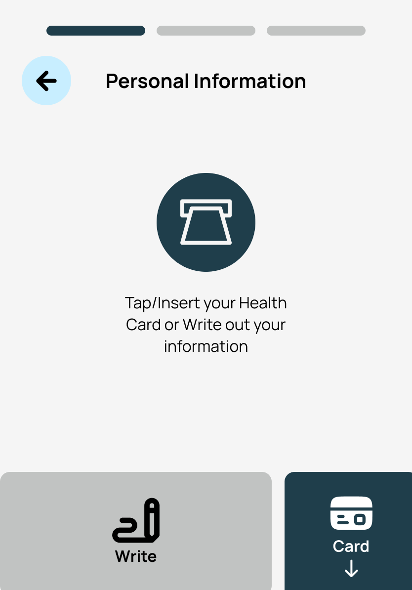
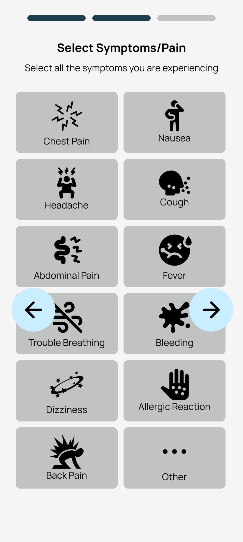
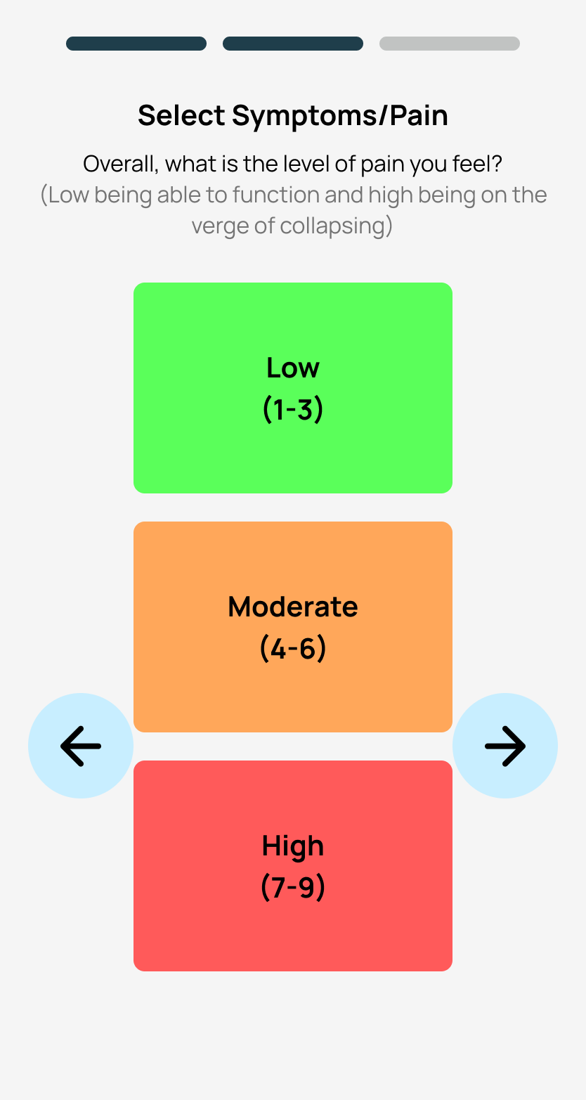
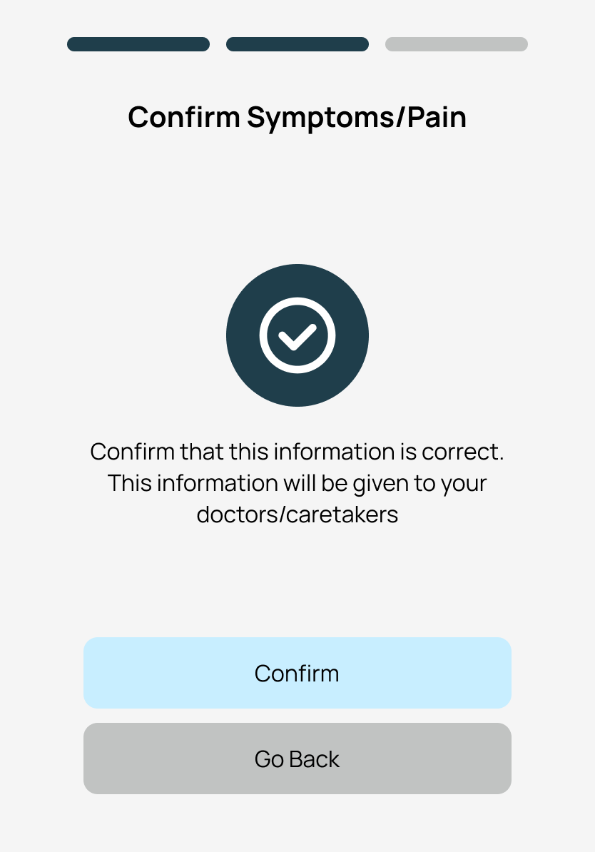
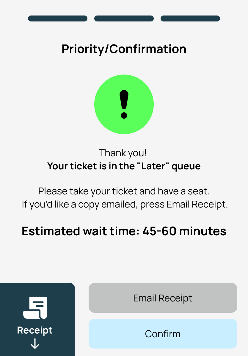
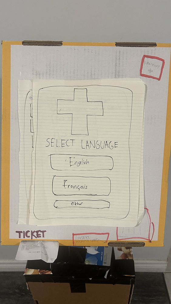
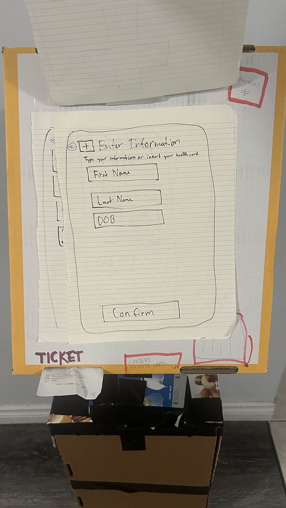
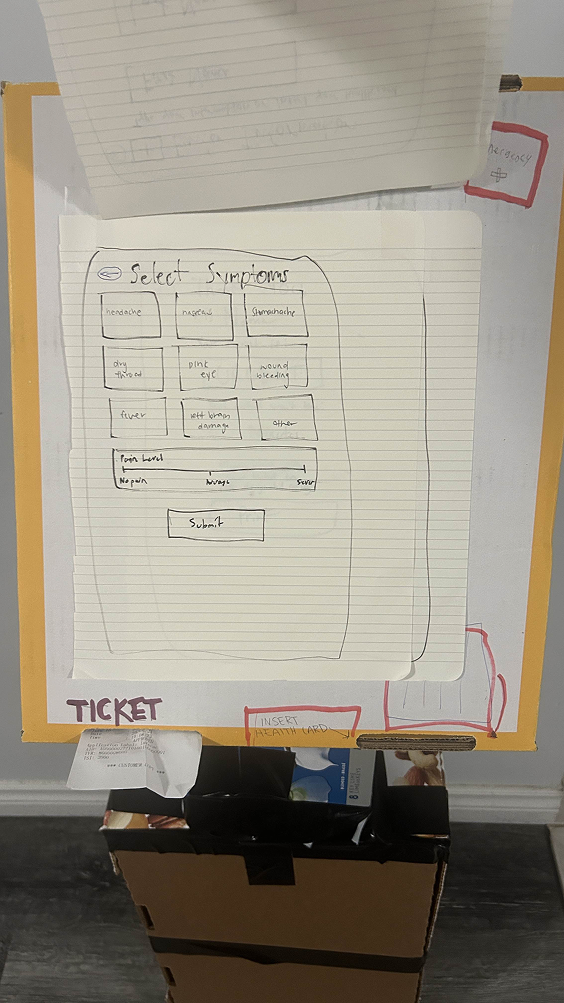
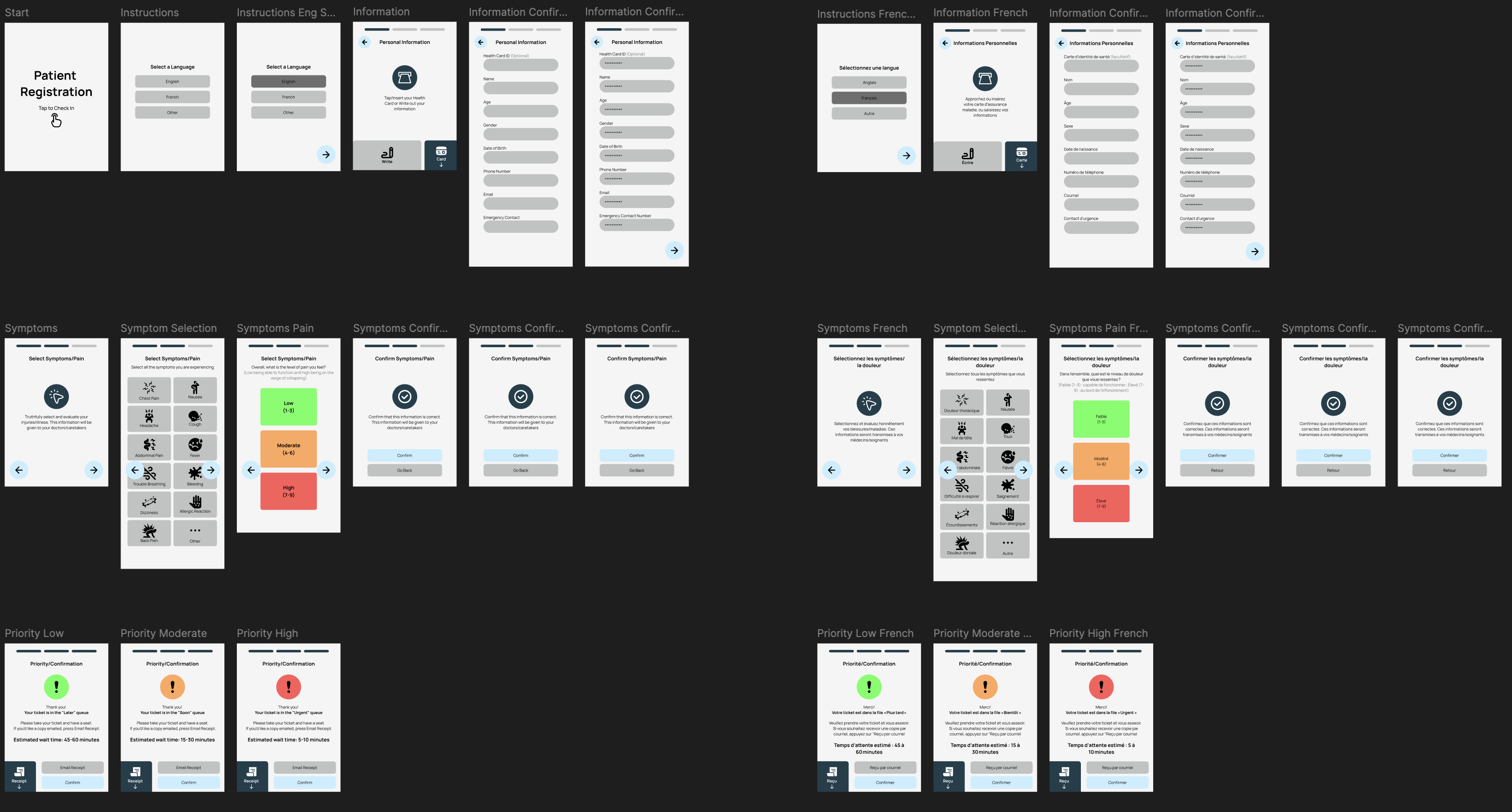
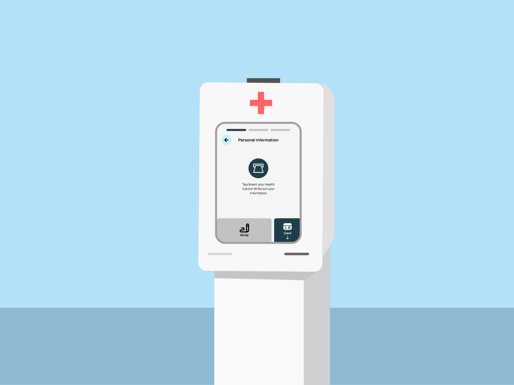
Everyone loses. Patients feel abandoned. Staff burn out. Critical information slips through the cracks. We set out to change that dynamic by designing a self-triage system that collects standardized data quickly, provides transparent feedback to patients, and integrates seamlessly into existing workflows.

"I just want to know someone sees me. Even a number in a queue would help."

โ€” ER Patient, Field Interview
๐Ÿฅ

Emergency room journey map โ€” Under construction learning motion design โš ๏ธ

02

The Challenge

How Might We

Reduce intake friction while keeping patients informed and giving nurses actionable contextโ€”all without adding complexity to an already chaotic environment?

โฑ๏ธ

Manual Data Entry

Adding 127 seconds per patient while nurses babysit forms instead of checking vitals.

๐Ÿ—บ๏ธ

No Visibility

Patients have no idea where they stand in the queue, increasing anxiety and perceived wait times.

๐Ÿ”€

Inconsistent Prioritization

Manual symptom recording leads to variability between staff members and shifts.

๐ŸŒ

Communication Barriers

Language differences and stress make it hard to articulate symptoms under pressure.

Design Principles

01

Clarity Under Stress

Every interaction must work in poor lighting, high noise, and split-second urgency.

02

Universal Accessibility

Language, mobility, and visual impairments can't be barriers to care.

03

Trust Before Data

Earn patient confidence before asking for sensitive information.

03

Research & Discovery

We started by mapping the patient journey and talking to healthcare professionals to understand where the system breaks down and where design could make a difference.

๐Ÿฅ

Field Observation

Walked the floor, timed every handoff, and catalogued stress points across a full shift.

127s Added per patient from manual entry
๐Ÿ—ฃ๏ธ

Stakeholder Mapping

Mapped patients, triage nurses, and clerks together to close handoff gaps that spark hallway fire drills.

3 Journey maps created
โœ“

Clinical Validation

ER nurses and physicians pressure-tested safety checks, escalation paths, and documentation.

100% Confirmed pilot feasibility
๐Ÿ“Š

Data Analysis

Analyzed wait time data and error rates to identify the highest-impact intervention points.

30% Reduction in data errors

Why These Methods

๐Ÿฅ Field Observation

Reading about ER workflows wasn't enough. We needed to feel the chaos firsthand to design for it authentically.

๐Ÿ—ฃ๏ธ Stakeholder Mapping

Different roles experience the same process differently. Joint mapping revealed friction invisible to individual interviews.

โœ“ Clinical Validation

Healthcare design requires clinical sign-off. Early validation prevented costly pivots later.

๐Ÿ“Š Data Analysis

Quantitative data helped prioritize which pain points had the biggest impact on patient experience.

Key Insights

01
"I spend more time on forms than on patients."

Nurses are documentation machines. Freeing their hands means more face-to-face care time.

02
"I don't know what's happening. Am I forgotten?"

Opacity breeds anxiety. Simple queue visibility transforms the emotional experience.

03
"Every nurse asks me the same questions."

Information doesn't travel. Structured data capture prevents redundant interrogation.

๐Ÿ“Š

Affinity map โ€” Under construction learning motion design โš ๏ธ

04

The Solution

A Guided Check-in That Works for Everyone

Pulse is a self-triage kiosk that collects symptoms through an accessible interface, provides real-time queue updates, and delivers structured data to clinical staff.

1

Language Selection

English, French, and additional languages break down communication barriers from the first tap.

Solving: Communication barriers for diverse patient populations
2

Health Card Integration

Quick card scan pulls patient info automatically, reducing manual data entry.

Solving: 127 seconds of manual entry per patient
3

Symptom Grid

Icon-based selection with plain language labels makes complex medical communication accessible.

Solving: Inconsistent symptom recording across staff
4

Pain Assessment

Visual face scale makes pain communication universal, avoiding subjective language.

Solving: Language and cultural barriers in pain expression
5

Queue Tracking

QR code on printed ticket links to live queue updates for continuous visibility.

Solving: Patient anxiety from lack of visibility

Key Screens

Every screen was optimized for the worst conditions: poor lighting, high stress, and split-second decision making.

Language selection screen

Language Selection

Large, clear options with visual icons ensure patients from any background can start confidently.

Card scan screen

Health Card Scan

Animated illustration shows exactly where to insert the card, with manual entry always visible.

Symptom selection screen

Symptom Selection

Icon grid with plain language labels lets patients communicate complex symptoms quickly.

Pain assessment screen

Pain Assessment

Simple slider with visual face scale makes pain communication universal.

Confirmation screen

Review & Confirm

Clear summary of entered information with easy edit access before finalizing.

Ticket screen

Queue Access

Printed ticket includes QR code for live queue tracking with neutral, calming language.

05

Design Process

We iterated through multiple rounds of testing to ensure Pulse worked in the high-stress, high-stakes environment of an emergency department.

Phase 01

Physical Exploration (Bodystorming)

We physically acted out the check-in process, tapping through mock screens, scanning health cards, and printing tickets. This hands-on exploration revealed critical issues that traditional wireframing would have missed.

What We Learned
  • Progress indicators were essential to reduce anxiety
  • Card-scan icons looked like static graphics, not interactive elements
  • Standing height affected screen visibility for different users
Bodystorming session
Physical prototype testing
Phase 02

Paper Prototyping

Paper prototypes let us simulate the flow and observe real user behavior without investing in high-fidelity design. Low stakes meant faster iteration.

What We Learned
  • Step confirmations and back buttons needed to be prominent
  • Text contrast was critical for accessibility
  • Emergency bypass button needed high visibility
Paper prototype iteration
Paper prototype refinement
Paper prototype detail
Phase 03

High-Fidelity Prototype

Using Figma, we built a complete interactive system. We translated findings into a cohesive visual language designed for high-stress moments: soft blues, high contrast, and minimal text with audio and visual confirmation cues.

Complete wireframe overview
Design system

Try It Yourself

Walk through Pulse from language selection to ticket printing. Notice how every interaction is designed for clarity under stress.

Open full prototype โ†—
06

Reflection & Impact

โšก 20-25% Faster Intake
โœ“ 100% Clinical Validation
๐Ÿ“Š 30% Fewer Data Errors
๐Ÿ’š Improved Patient Comfort

What I Learned

๐ŸŽฏ

Context is Everything

Successful service design happens where digital experiences meet real-world behavior. What works in a coffee shop will never fly in an emergency room. Bodystorming revealed issues that wouldn't have surfaced in traditional wireframing.

๐Ÿค

Stakeholder Alignment

Healthcare design requires clinical sign-off at every stage. Building relationships with nurses and physicians early prevented costly pivots and ensured feasibility.

๐Ÿ“ˆ

Stress-Test Everything

Every design decision had to account for stress, poor lighting, mobility constraints, and split-second urgency. Designing for the worst case meant the average case felt effortless.

๐Ÿ”ฎ

If We Continued...

Where this project could go next

01
Comprehensive Accessibility Testing
Validate the kiosk for mobility and visual impairments to ensure truly universal access.
โ™ฟ Inclusion
02
Staff Dashboard with AI Forecasts
Build predictive analytics for crowding trends so nurses can anticipate surges.
๐Ÿ“Š Analytics
03
Hospital System Integration
Test data pipelines with existing EMR systems to enable seamless clinical workflows.
๐Ÿ”— Integration
04
Extended ED Pilot
Deploy in a real emergency department with diverse patient populations for longitudinal validation.
๐Ÿฅ Pilot