Back to Projects
Co-operators Design Jam 2025 6 min read

Turning Financial Anxiety Into Confident Planning

In one week, I redesigned how Canadians plan for life milestones with Co-operators. The result: a milestone planner that builds trust before asking for details.

Role Lead UX Designer
Timeline 1 Week Sprint
Team 5 Designers
Tools Figma, FigJam, Miro
Secure Your Future milestone planner mockup

Secure Your Future milestone planner interface

โšก TL;DR

We flipped the script: start with life goals, not policy questions. In usability testing, 100% of participants completed the full flow; comparative analysis suggested a projected improvement in lead quality versus the existing product-first portal.

100% Task Success (Testing)
+65% Projected Lead Quality
5 Pilot Teams
Scroll to explore
01

The Story

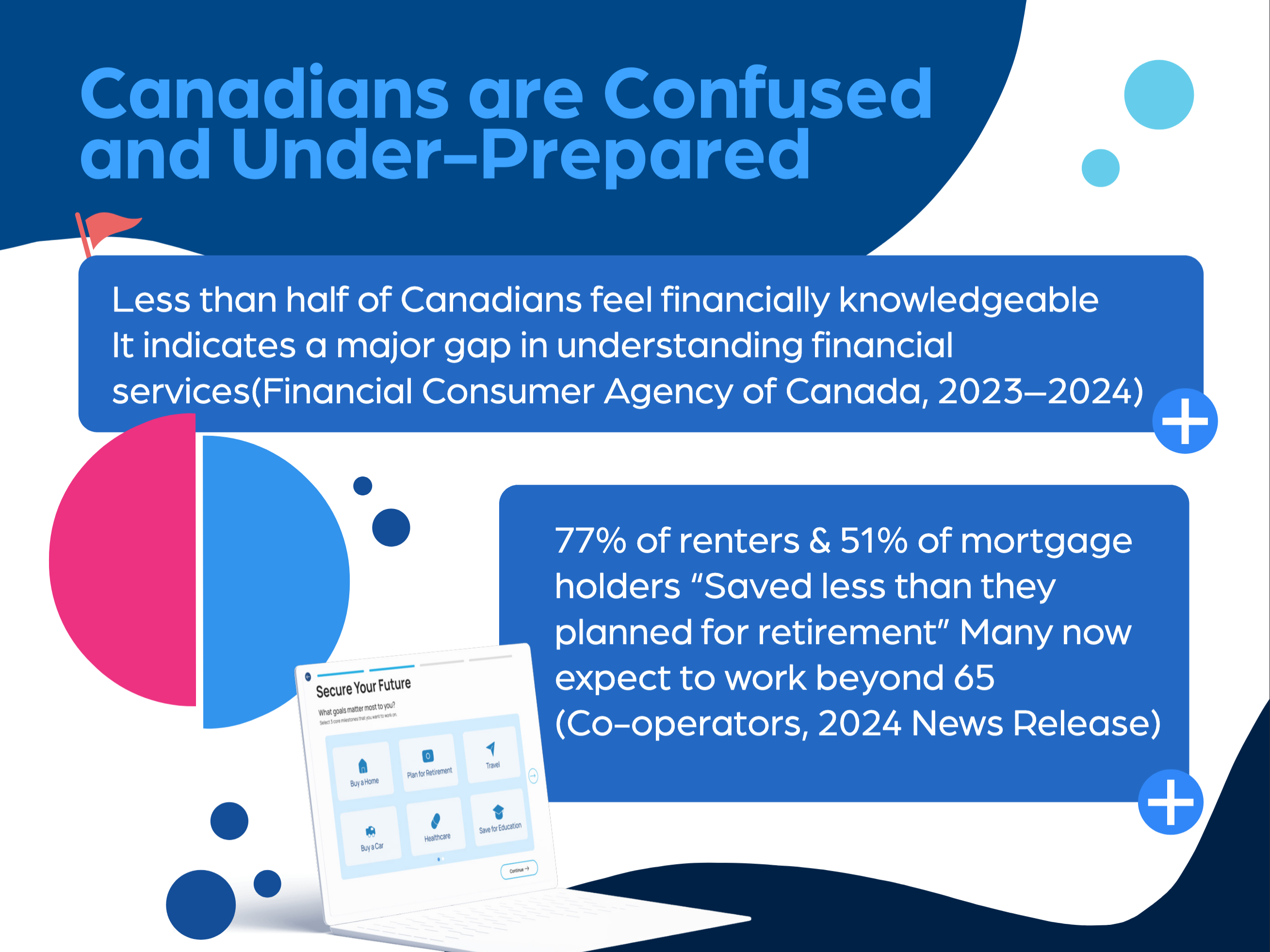
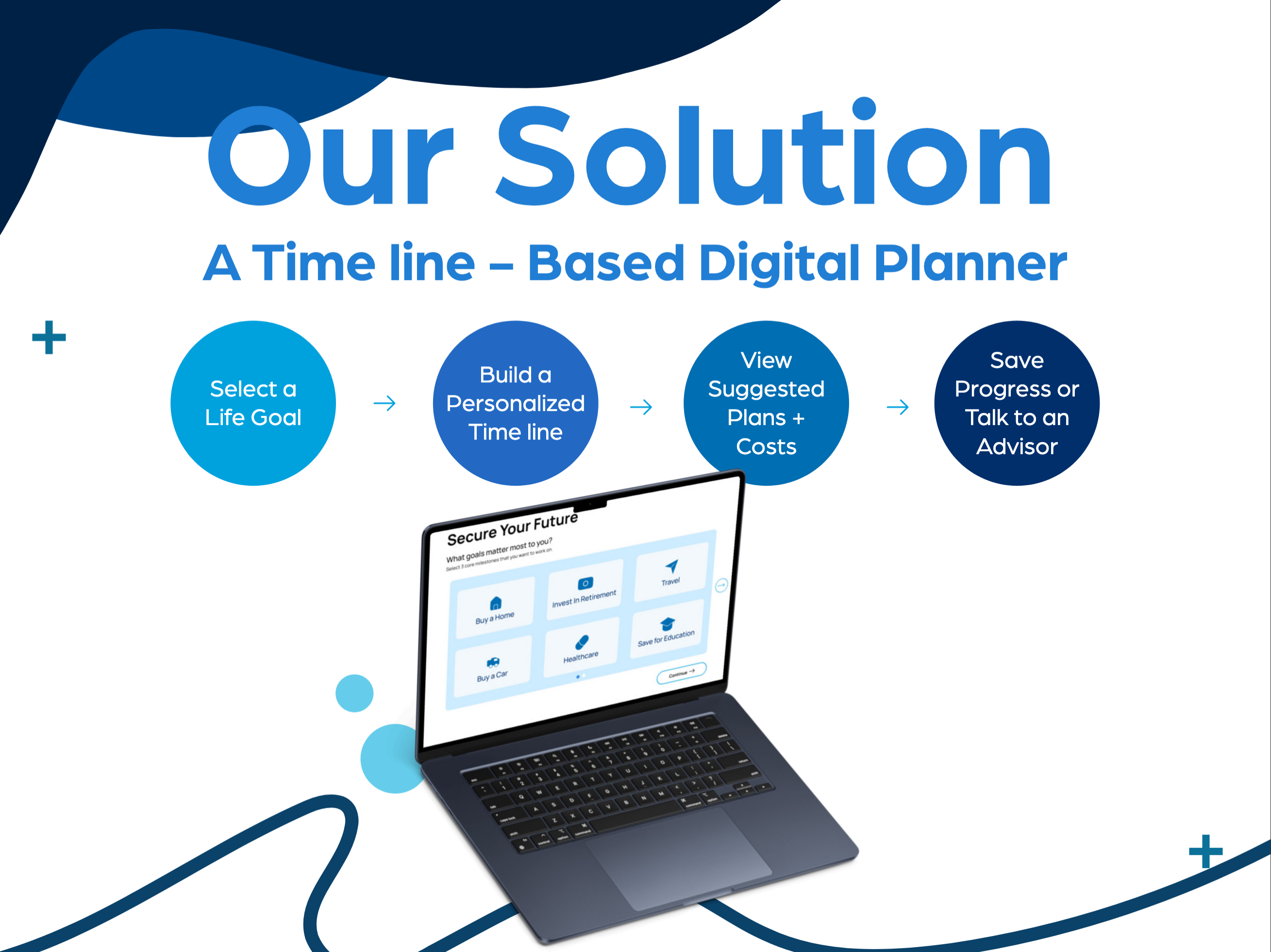
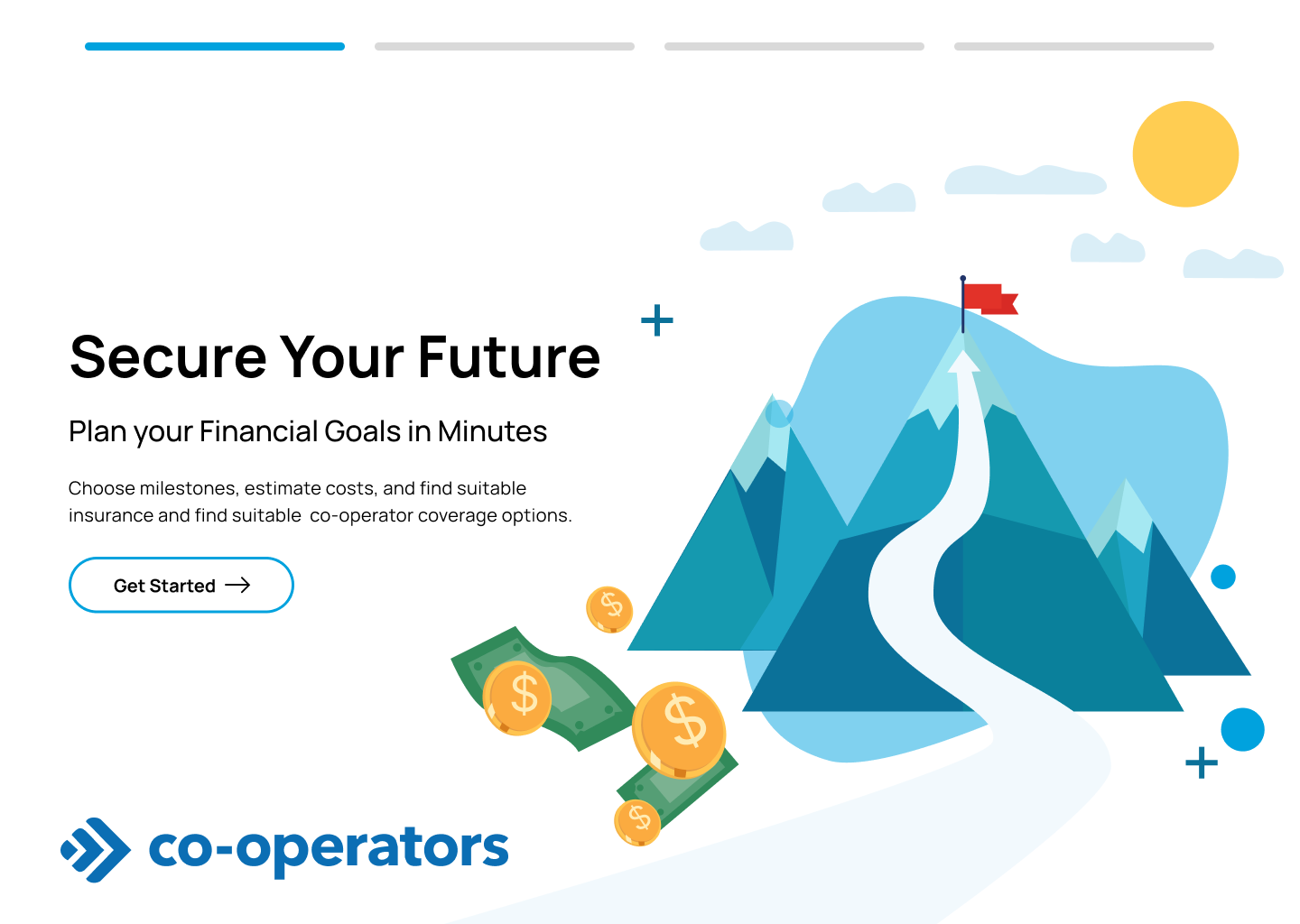
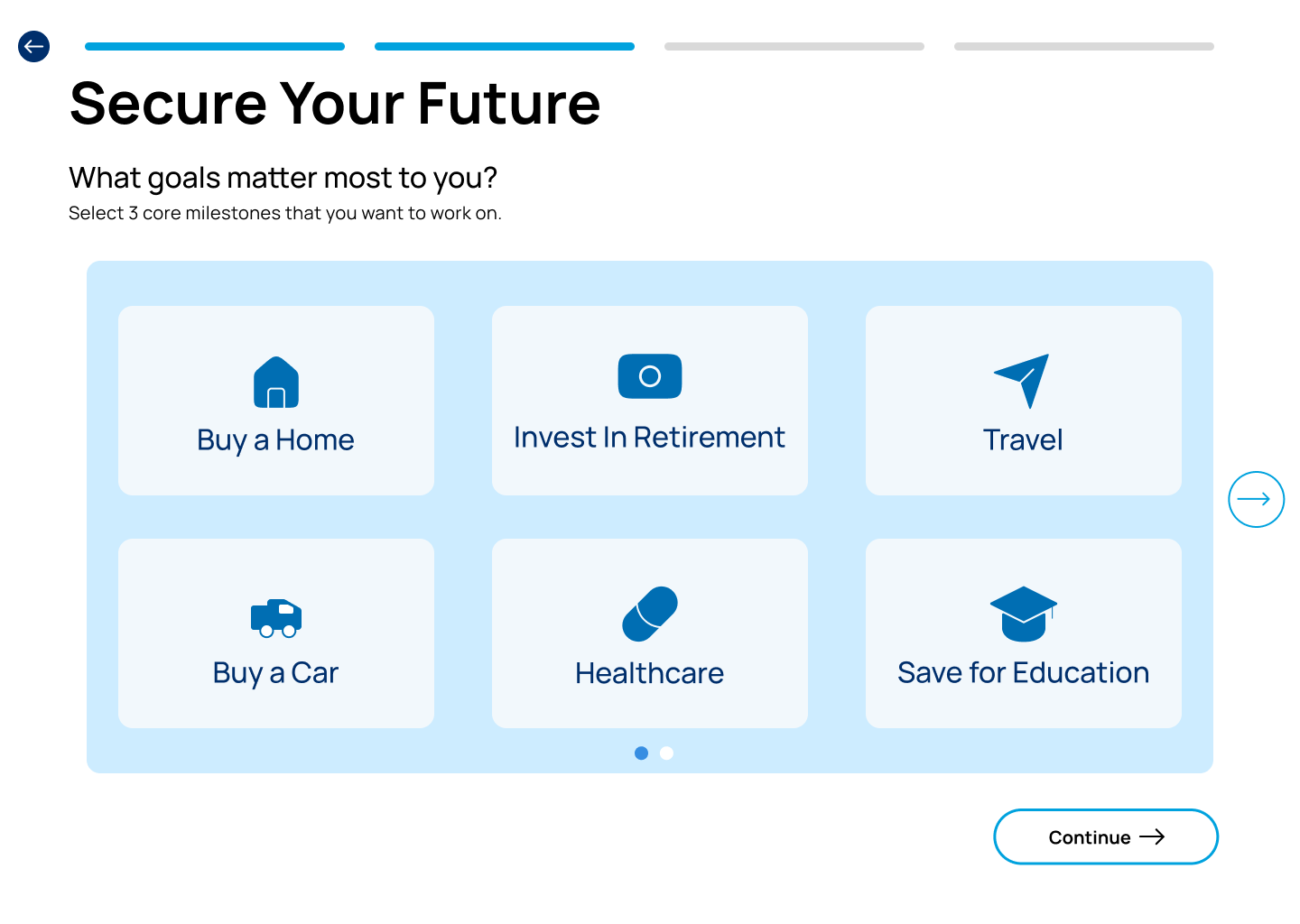
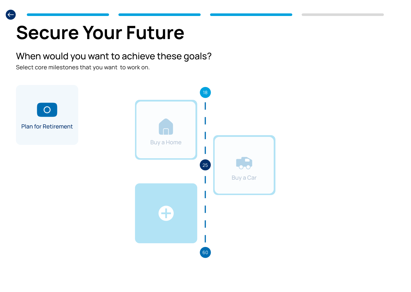
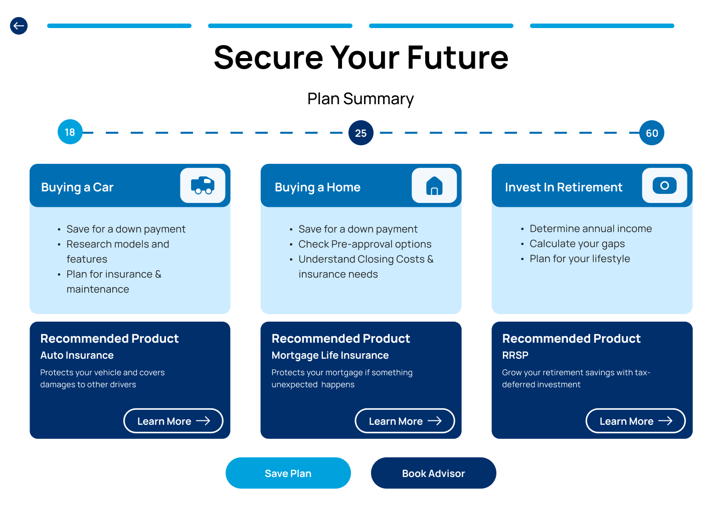
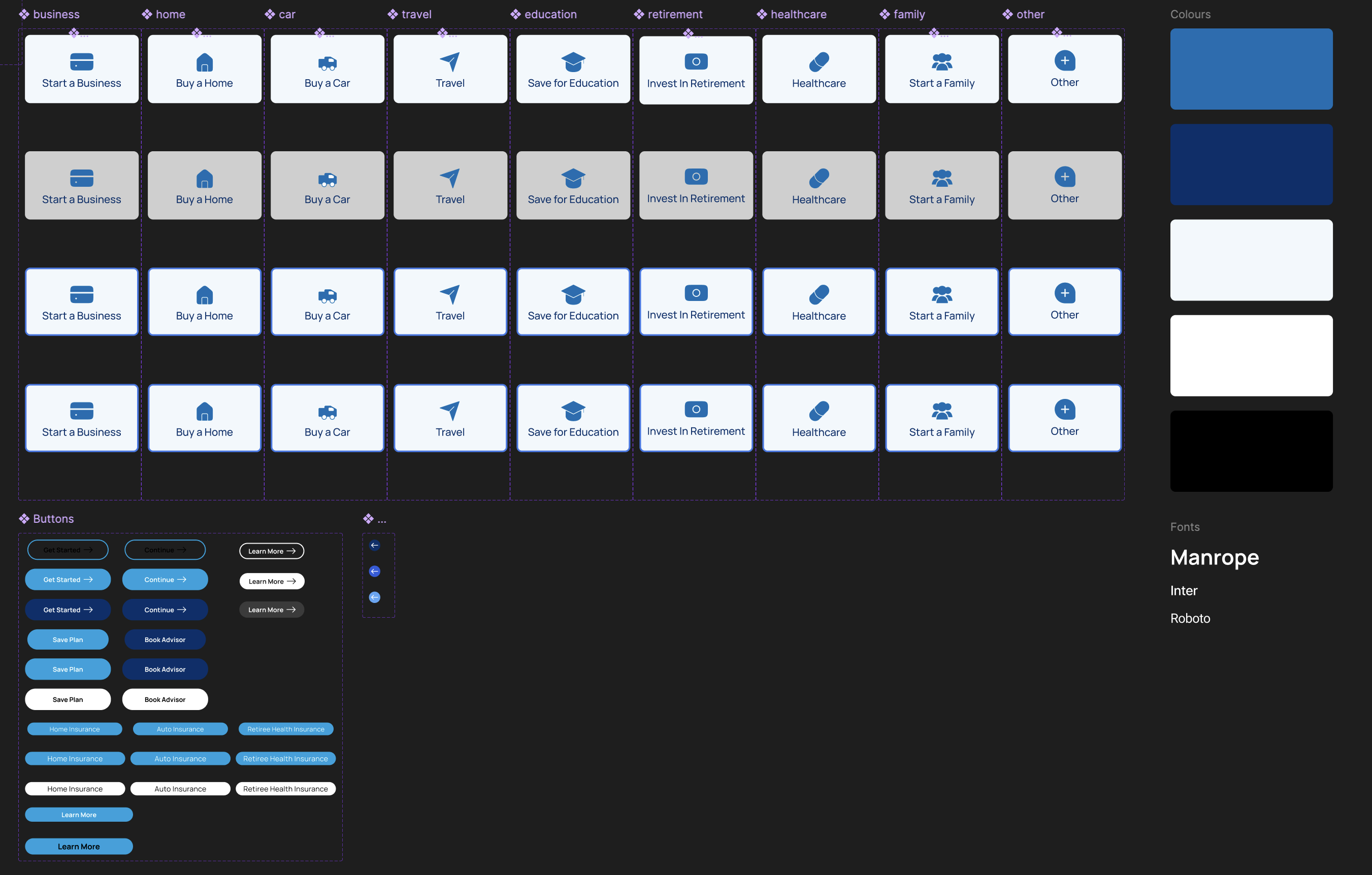
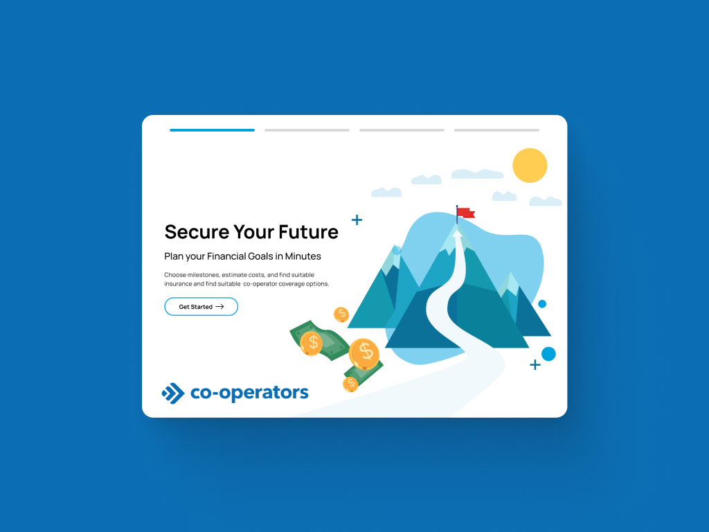
Most Canadians feel overwhelmed by financial planning. We reframed the process around life moments so folks can imagine a future version of themselves before anyone talks numbers.

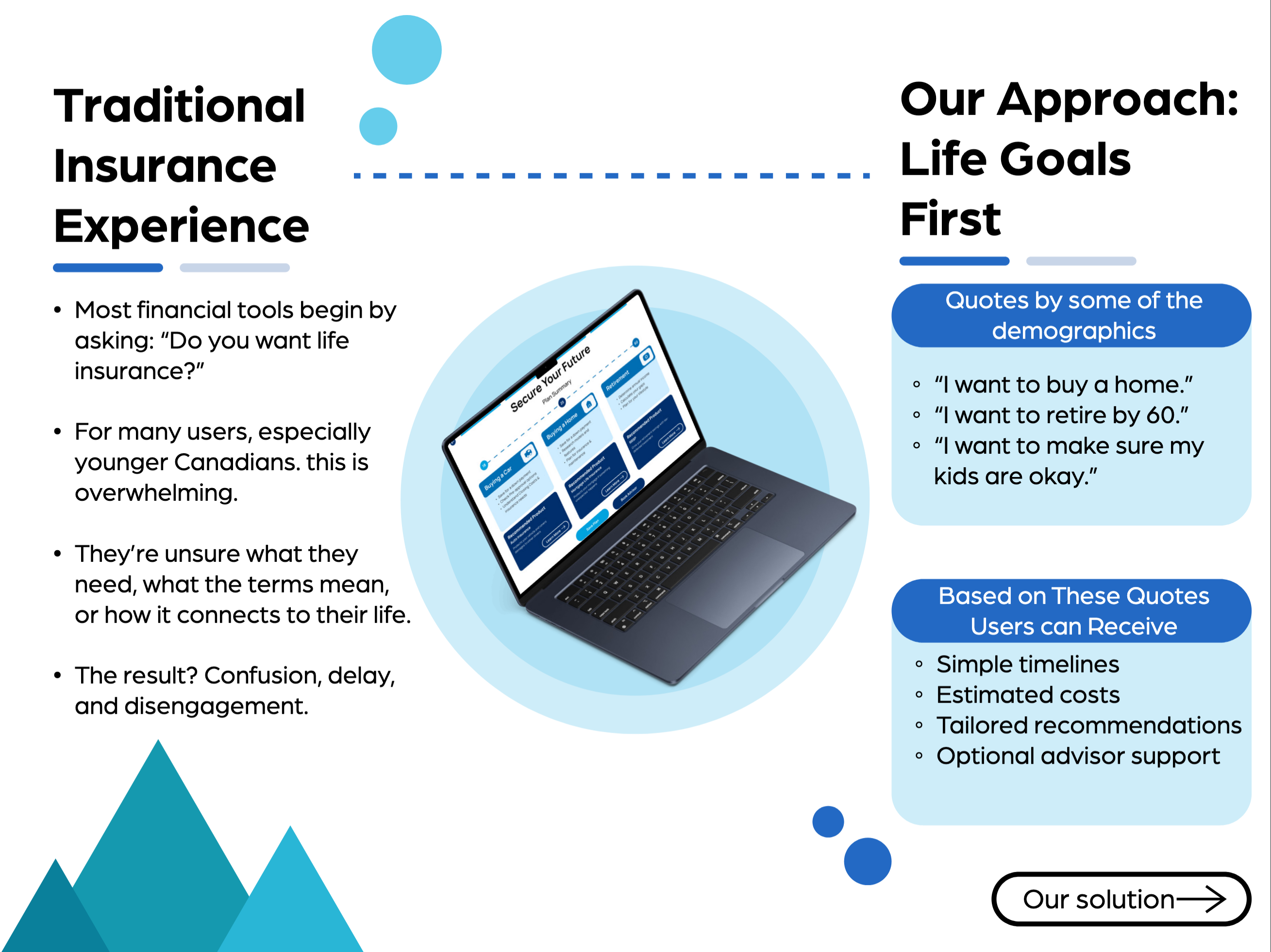
People don't wake up thinking "I need insurance." They think about buying a home, starting a family, or retiring comfortably. Traditional financial planning forced them to speak a foreign language first. Product-first portals led with policy questions before users even understood how coverage supported their lives.

I led the concept-to-prototype journey: research synthesis, experience mapping, and interaction design. The team collaborated on flows and visuals; my focus was making a planner that earns trust before it asks for details.

"Users don't plan by product. They plan by life event."

โ€” Team Insight
30% of Canadians are underinsured
1 in 3 feel confident about finances
7 days to design, test & deliver
02

The Challenge

How Might We

Help Canadians feel confident about financial planning by starting with their dreams instead of intimidating policy jargon?

Complete user flow from landing to personalized plan

Research data revealing the financial literacy gap across demographics

๐Ÿ“š

Too Much Jargon

Portals led with policy questions before users understood how coverage supported their lives. The language felt cold and transactional.

๐ŸŽฏ

No Personalization

Dense terminology and long forms chipped away at confidence before value was visible. Everyone got the same experience, regardless of goals.

โ„๏ธ

Cold Handoffs

Advisors received little context about users' dreams and priorities, so outreach felt generic instead of tailored and empathetic.

From Product-First to Milestone-First

We moved from leading with policy questions to leading with life goals. The visual below captures the shift our research and design supported.

Research data showing the financial literacy gap

Left: product-first portals ยท Right: our milestone-first approach

Design Pillars

๐ŸŒ„

Start With Goals

Users pick the milestones they care about. Their priorities lead, not ours.

๐Ÿงญ

Guide With Clarity

Plain language and visual timelines make progress tangible without overwhelming.

๐Ÿค

Empower Advisors

Goal context travels with every lead so follow-up feels informed and empathetic.

03

Research & Discovery

We talked to Canadians across life stages and worked with Co-operators advisors to understand what makes financial planning feel approachable.

Research and discovery synthesis

Research and discovery

30% Of Canadians are underinsured
1 in 3 Feel confident about finances
70% Expect mobile-first simplicity

Three Personas Guided Our Decisions

Paige (early career), Farah (mid-career), and Irene (pre-retirement) shaped where we put emphasis: quick clarity for Farah, gentle onboarding for Paige, and reassurance for Irene.

๐Ÿ‘ฉโ€๐ŸŽ“

Paige, 22

Early Career

"I just need someone to explain where to start."

๐Ÿ‘ฉโ€๐Ÿ’ผ

Farah, 39

Mid-Career

"I'm juggling goals and I need clarity fast."

๐Ÿ‘ต

Irene, 62

Pre-Retirement

"I want reassurance I've saved enough."

04

The Solution

Five Screens That Translate Dreams Into Action

Each step was designed to build trust before asking for commitment. For Paige we kept the welcome and goal picker simple; for Farah we made the timeline and next steps fast to scan; for Irene we emphasized clear summaries and one-tap advisor booking.

Product-first vs milestone-first approach comparison

End-to-end user flow โ€” from welcome screen to personalized action plan

1

A Warm Welcome, Not a Sales Pitch

The mountain path hints at steady growth and the journey ahead. A single "Get Started" button invites people in without pushing products.

UX Principle: Reduce cognitive load by offering one clear action
Landing page with mountain illustration
2

Pick What Matters to You

Users choose up to three milestones that matter most: buying a home, planning retirement, starting a family. The interface adapts instantly.

UX Principle: Personalization increases engagement and relevance
Goal selection interface
3

Map Your Future

A visual, interactive timeline transforms abstract ambitions into tangible plans. Drag-and-drop chips map to age ranges, making the future feel real.

UX Principle: Visual feedback makes abstract concepts concrete
Timeline builder interface
4

From Goals to Actionable Steps

Each milestone expands into practical next steps, educational resources, and relevant offerings. One tap books an advisor with all context attached.

UX Principle: Progressive disclosure reduces overwhelm
Personalized plan summary
05

Design Process

Every element was designed to feel warm, approachable, and trustworthy. The visual system balances the gravitas of financial planning with the optimism of life goals.

Complete design system overview

Complete design system โ€” from principles to production

Experience the Full Flow

Walk through from milestone onboarding to tailored plan summaries.

Open full prototype โ†—
06

Reflection & Impact

Lead Completion Rate
Static forms Interactive planner Projected +65%
Task Success
High abandonment 100% completion Full success
Advisor Context
Minimal from forms Goal-based narratives Rich context

How We Measured Impact

In one sprint week, we validated our approach through rapid iterative testing.

๐Ÿ“‹

Baseline Benchmarking

Mapped existing Co-operators portal metrics: form completion rates, drop-off points, and advisor feedback on lead quality.

๐Ÿ“Š Funnel analysis ๐Ÿ’ฌ Advisor interviews
๐Ÿงช

Moderated Usability Testing

Ran 3 rounds of task-based testing with 5 participants each, observing milestone selection, timeline building, and plan review.

๐Ÿ‘ค 15 participants ๐ŸŽฏ Task-based โฑ๏ธ Think-aloud
๐Ÿ“ˆ

Comparative Analysis

Compared our prototype's completion and confidence metrics against the baseline to quantify the milestone-first advantage.

โœ… 100% task success ๐Ÿ“Š Projected lead quality ๐Ÿ˜Š High confidence

Key Finding

Users who started with milestones completed the full flow 100% of the time versus high abandonment on the product-first portal. In advisor feedback during the sprint, leads were described as having 2โ€“3ร— more context for meaningful conversations.

Metrics based on usability testing within the design jam sprint. Production validation would require A/B testing at scale.

What I Learned

๐ŸŽฏ

Start With Goals, Not Products

Leading with milestones instead of insurance jargon turned intimidation into aspiration. People don't plan by policy; they plan by life event.

๐Ÿค

Bridge Digital and Human

The best digital tools don't replace advisors. They prepare users to have better conversations, and context travels with every lead.

๐Ÿ“ˆ

Measure What Matters

The projected lift in lead quality from testing gave us a signal that milestone-first planning works. User quotes like "It finally makes sense" reminded us why we built it.

๐Ÿง 

Empathy Over Efficiency

Speed matters, but not at the cost of understanding. Framing questions around life events made users feel heard, not processed.

๐Ÿ”—

Context is Currency

The real innovation wasn't the UI โ€” it was passing rich goal context to advisors. In sprint feedback, advisors said they could skip the "what do you care about?" opener and go straight to relevant options. We didn't validate that at scale, but it pointed to where the value lived.

โšก

Constraints Sharpen Focus

A one-week sprint forced us to ruthlessly prioritize. We shipped a complete concept because we said no to nice-to-haves early.

๐ŸŒฑ

Design for Growth

The milestone architecture is inherently extensible. New life events slot in without redesigning the core flow.

๐Ÿ’ก Key Takeaway
"The best financial tools don't start with money โ€” they start with the life you want to live."
๐Ÿ”ฎ

If We Continued...

Where the journey leads next

01
Expand Milestone Library
Add more life events based on user feedbackโ€”from business ownership to parental care.
๐ŸŽฏ Content
02
Advisor Context Dashboard
Build a dashboard that gives advisors rich context before every call, improving conversion.
๐Ÿ’ผ B2B
03
A/B Test Timeline Interactions
Experiment with different timeline builder interactions to optimize engagement and completion.
๐Ÿงช Experimentation
04
AI Milestone Recommendations
Explore AI-powered suggestions that predict which milestones matter based on user context.
๐Ÿค– AI/ML